Reading Your Team's Shooting Chart
Your shooting chart has more to say than you think. Here's how to read it, what to look for, and what to change at practice.
Your team took 88 shots so far this season. You know how many went in. But do you know where they came from? Which side of the field? What distance? How many never even hit the cage?
That's what your shooting chart is for.
SquadProfile's Shooting Analytics screen breaks down every shot your team takes by location, distance, and result. We'll walk through each piece and what to do with what you find.
Start With the Big Picture
When you open Shooting Analytics, four numbers run across the top:
- S% is your shooting percentage (goals ÷ total shots)
- SOG% is shots on goal percentage (shots that hit the cage or score ÷ total shots)
- Goals per game
- Missed per game
These set the baseline. A 25% shooting percentage with a 59% SOG rate tells you your team is getting the ball on cage, but the goalie is winning more than they should. A high miss rate tells you something different. Those shots never even tested the goalie. That's a shot selection conversation.
Read the Shot Chart
The shot chart plots every shot on a half-field diagram. Each dot is color-coded:
- Green for goals
- Blue for shots on goal (saved)
- Purple for misses
Before you filter anything, just look at the shape. Where are the dots clustered? Are they packed around the crease or scattered across the field? Is one side of the field completely empty?
That cluster is what your offense actually does, regardless of what you drew up on the whiteboard.
Toggle to the Heatmap
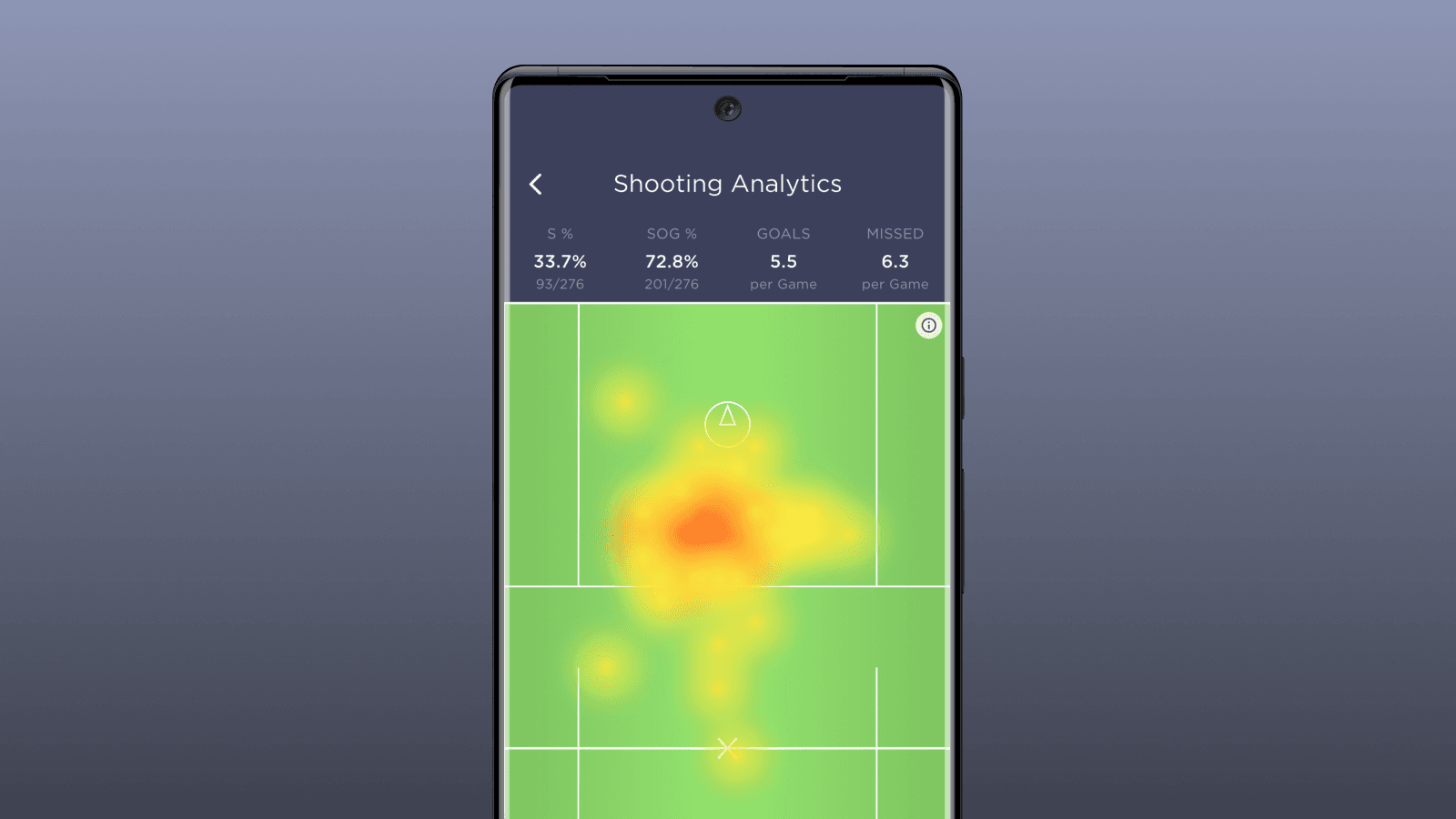
Tap Heatmap and the dots turn into a heat signature. Red and orange mark where you're shooting most. Yellow shows lighter areas.
The heatmap is less about individual shots and more about tendencies over time. A single red blob in front of the cage means your offense is funneling everything to the same spot. No color on one side of the field means you're not threatening from there.
Opposing coaches will notice the same thing on film. The heatmap just shows it to you first.
Filter by Result
Use the filter buttons (Goals, SOG, Missed) to isolate what's working and what isn't.
Filter to Goals only and look at where you're actually scoring from. If every goal comes from inside five yards, your perimeter game isn't converting. That might be fine, or it might mean you're settling for low-percentage looks when the defense takes away the inside.
Filter to Missed and shot selection problems jump off the screen. A cluster of purple dots from 15+ yards out means your players are pulling the trigger too early. Misses from in close could be a footwork or angle issue. Where the misses are tells you why they're happening.
Use the Distance Slider
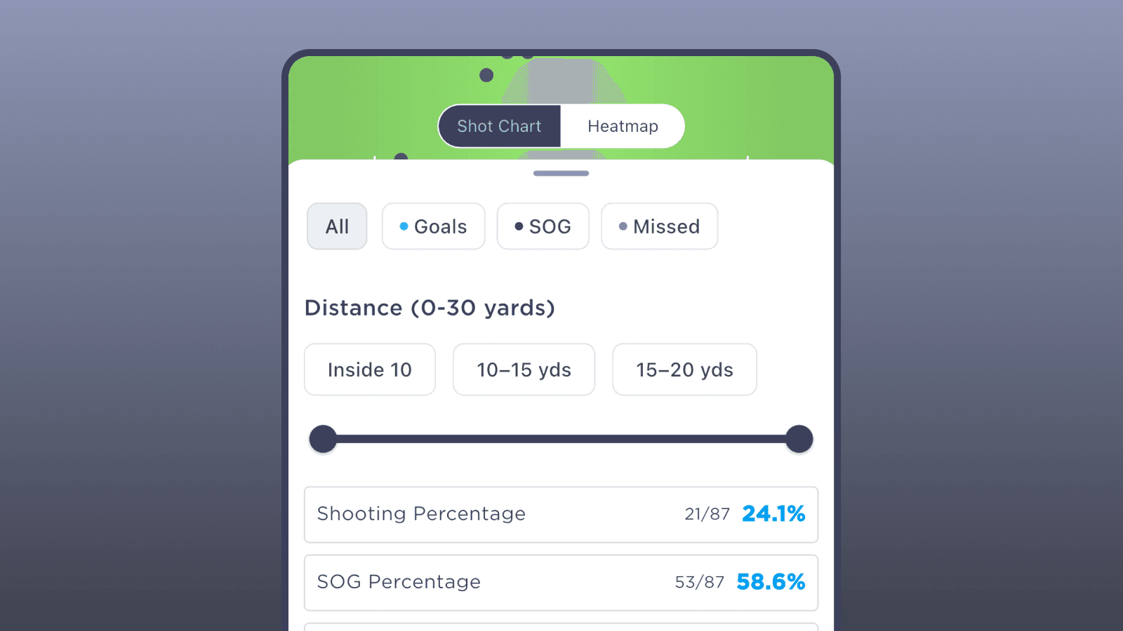
The distance filter breaks shots into ranges: Inside 10 yards, 10–15, 15–20, or set a custom range with the slider.
Say your team shoots 25% from inside 10 but 8% from 15–20. Now you know exactly what a quality look is for your offense. The next question is whether you're generating enough of those close-range opportunities or forcing things from the outside.
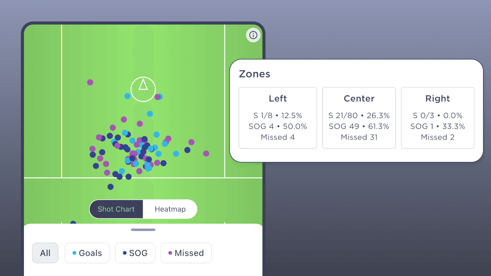
Check Your Zones
At the bottom, the Zones section splits the field into Left, Center, and Right. For each zone you get scoring percentage, shots on goal, and misses.
Think of this as a balance check. If 90% of your shots come from the center and almost none from the wings, your offense is one-dimensional. A defense that overloads the middle will shut you down.
But if you're 0-for-8 from the right side, that doesn't mean you need to force shots there. Maybe that's just not where your shooters are. The point is understanding whether that imbalance is a problem or just how your team is built.
What to Do at Practice
The shooting chart is a practice plan if you read it that way.
A high miss rate means spending time on shooting form and shot selection. Emphasize "good shots" from spots where your team actually converts. Not every dodge needs to end with a shot.
An empty zone means running sets that create looks from the weak side. If your lefties never get the ball on the right side of the field, now you can see it in the data instead of just feeling it from the sideline.
Low close-range percentage is a finishing problem. Quick releases around the crease, catch-and-shoot, off-hip, on-the-run. The looks are there.
And if outside shots aren't going in, the chart gives you the evidence to have that conversation with your players. It's not your opinion anymore. It's the data.
Pull It Up After Your Next Game
Film and data tell different stories about the same game. Your shooting chart is the quickest way to see what your offense actually looks like across a full season of work.
Open it up after your next game. Look at the shape. Filter it down. See what it tells you.